
Here are some important characteristics of the logos:
- I was worried about how visually cluttered the logo would become, I didn’t include an animal at first.
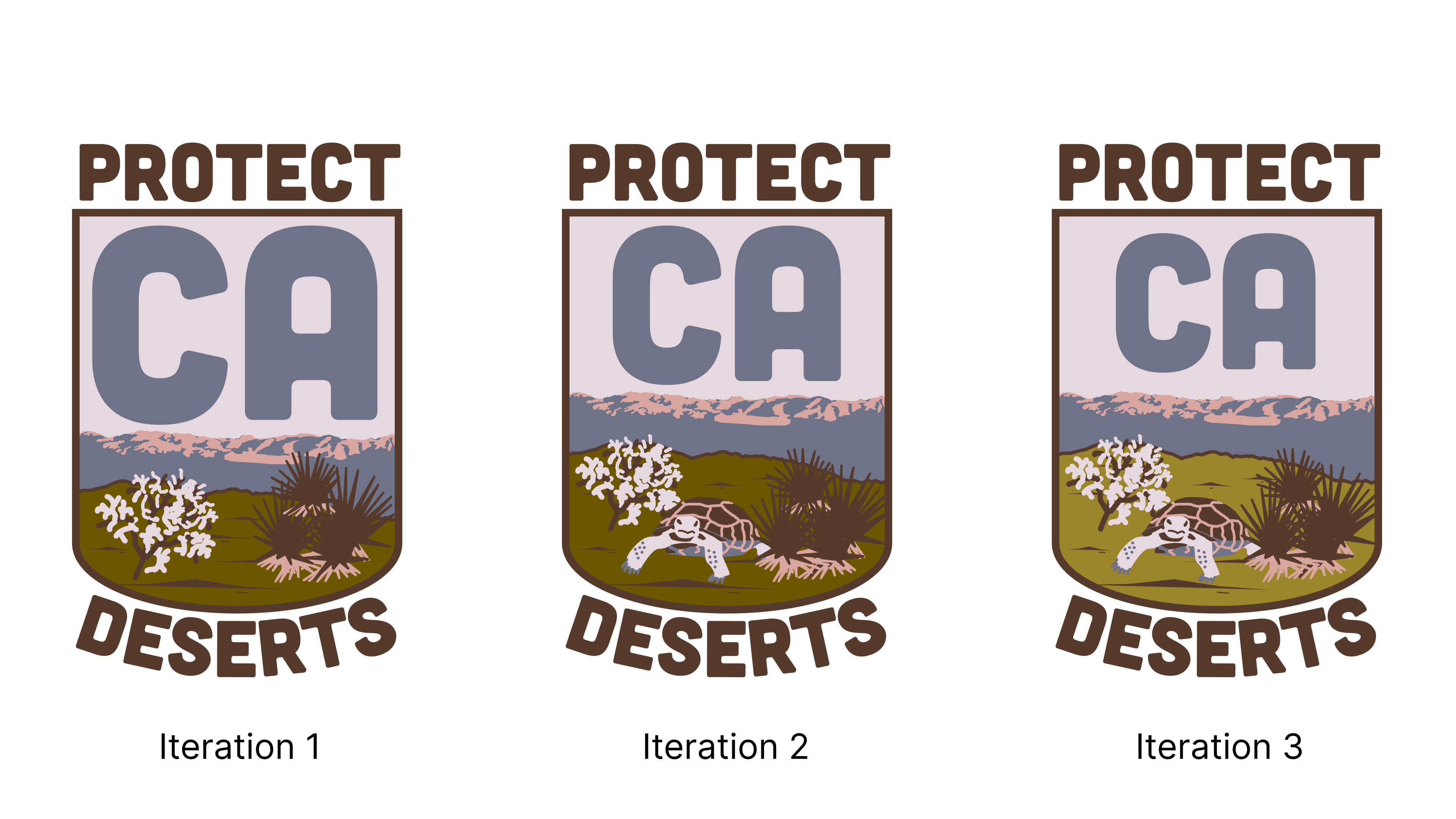
- I added the endangered Desert Tortoise after being asked to add an animal, since it speaks the most to their message.
-
Alongside it are a Cholla cactus and some Yucca plants, common plants in the California desert.
-
The background is based on a photograph of the
Piute Mountains Wilderness Area.
Unlike other projects, this was a contest. The first iteration asked for a square logo, with use of their provided palettes and suggestions of desert fluora and fauna such as desert tortoises, burro deer, black tailed jackrabbits, cholla cactus, yucca plants, and more. We were also asked to use Cubano as the font for the logo.

Initial sketches in Procreate, using their palettes and my own photography as the basis for landscapes.
Anyone who knows me well knows that the desert is very, very, very near and dear to my heart. One of my biggest regrets of having to leave California for Georgia in 2021 was having to leave the deserts of the Southwest behind, where I spent many many hours hiking, driving through, and photographing. It’s a subject and a place I’m incredibly passionate about.

Some initial versions of the logo, in the style of national park patches, which have gotten rather popular lately.
-
Left, a palette and mountain based on a photo I took from Key’s View in Joshua Tree National Park at dusk. This iteration wouldn’t work in the long run, as a gradient is unfriendly to cloth-patch processes, and I ditched the idea.
-
Right, a photo I took of the
Piute Mountains Wilderness Area from the Mojave National Preserve. These mountains are what grace the background of the patch.
Luckily for me, my initial iteration won the contest, and I was asked to make additional revisions to my logo.

Skipping an immediate showcase of the colors, I presented the client with black & white logo changes first, to demonstrate the implementation of the feedback.
The client requested:
- Increasing the vibrance of the color palette by pulling more from a suggested set
- Reducing “CA” by 20%
- Moving the mountain range upwards
- Adding an example of desert fauna between the plants
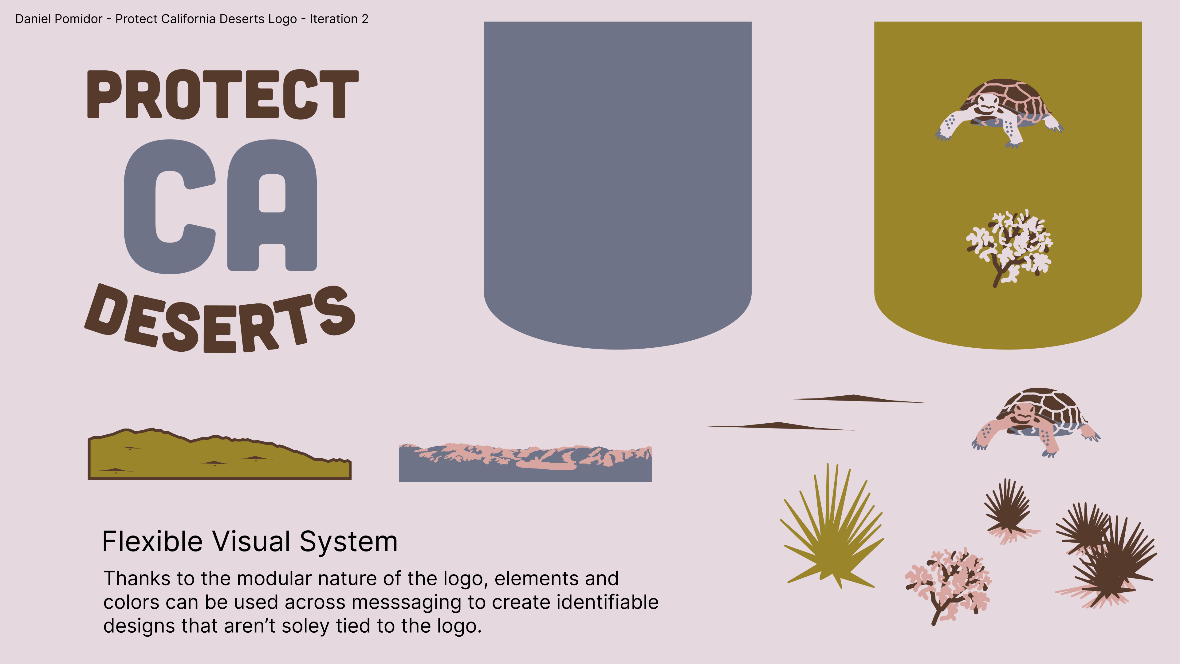
Flexible Visual System
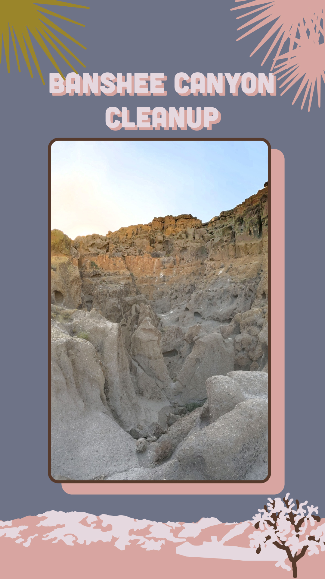
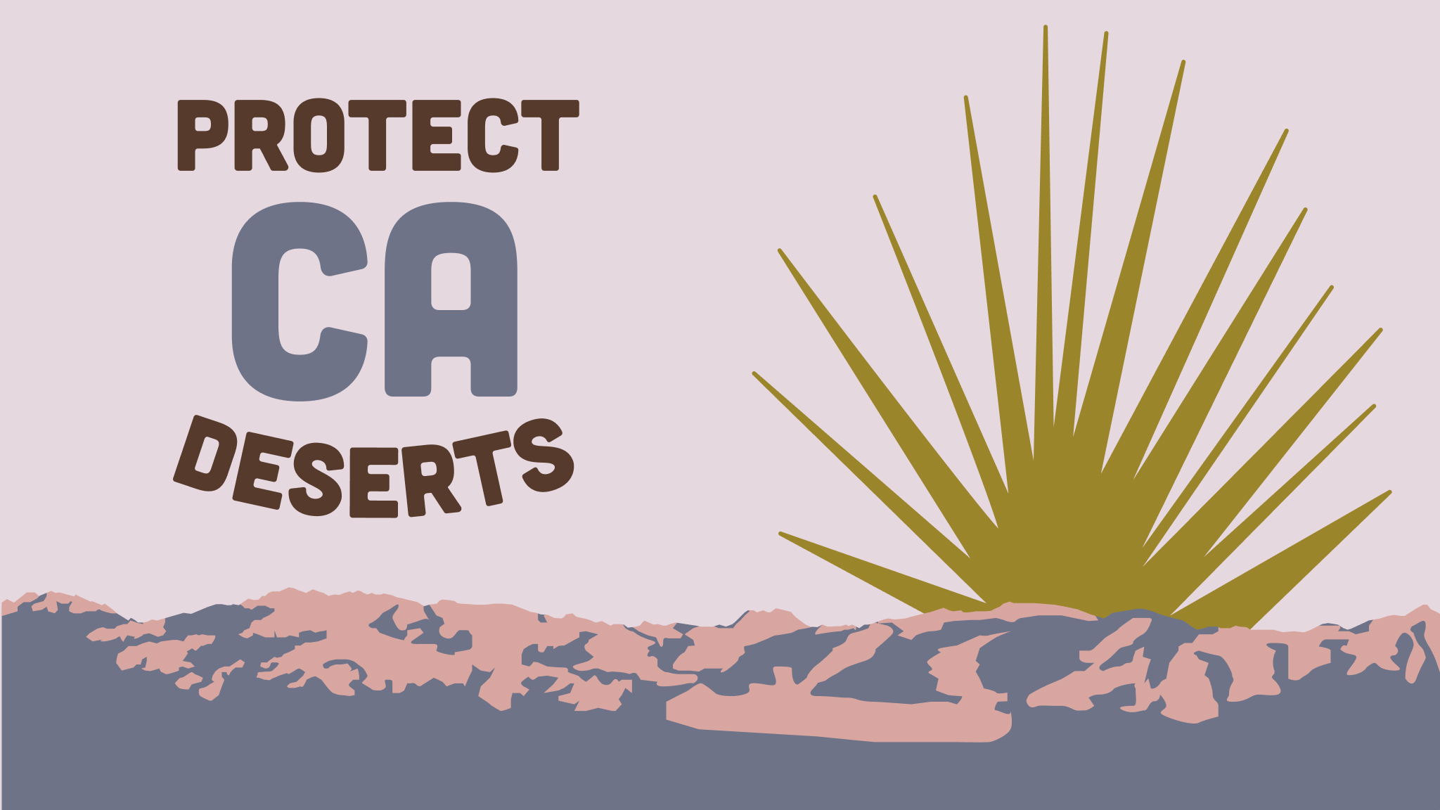
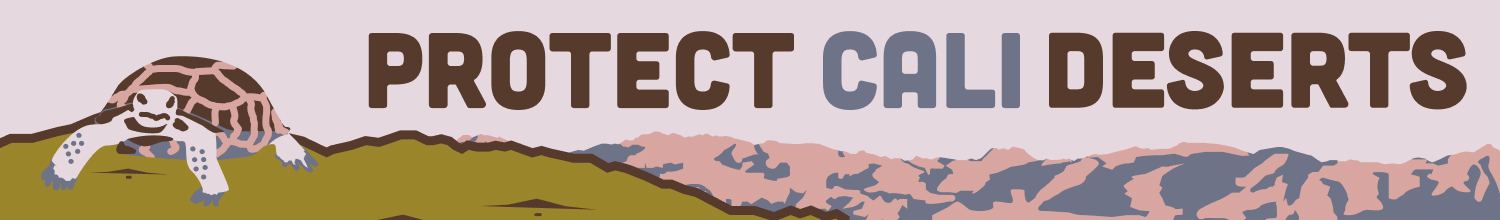
To go along with my presentation of the updated logo, I also included how the logo elements could be used as a Flexible Visual System to be used across social media, banners, and other use cases for the identity. I’ve included these examples below.