For this client, I was tasked with building their site, social media templates, and a brand guide to maintain a consistent presence for their store launch.
Though I didn’t craft the logo myself, as it was already sourced, I was tasked with building out the rest of the brand and giving them guidelines of how to properly utilize it. This meant constructing a Flexible Visual System, as has become the standard with most of my branding work.
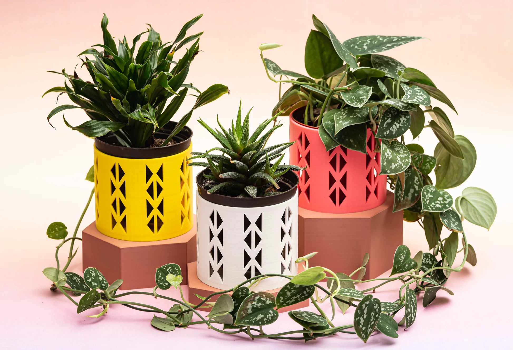
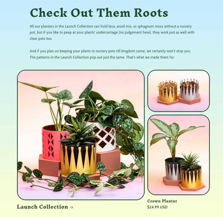
Specifically, I wanted the branding to embrace the 3D printing visual motifs they already had in their logo and planters, while avoiding being bland and flat - instead leaning into the fun and vibrant visuals that the plastic of 3D printing allows. Thus, food photography served as an inspiration for the project, which I sent to the business as art direction for their products and they embraced whole-heartedly.
Since the client wanted a wide spectrum of colors to pick from for lighting/product photography/product launches, I also made a very specific color usage guide dictating how to properly use their color styles.
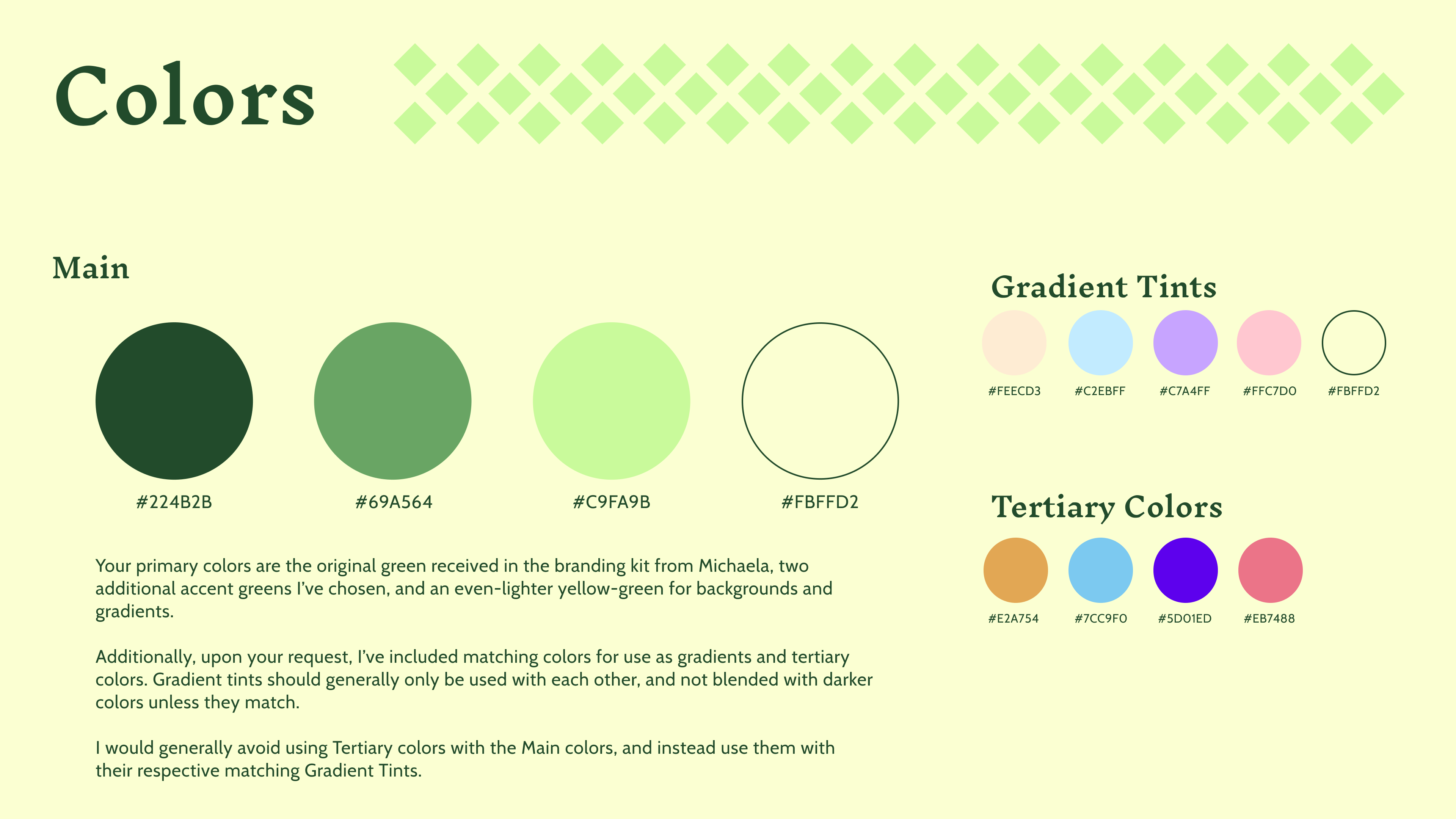

Color usage, with proper gradient usage
Separated pieces of the logo for the use of buiding patterns, background visuals, and more.
![]()
![]()


Some example social media post templates for Instagram.
![]()
![]()
Printed ephemera
![]()
![]()
The website


Printed ephemera
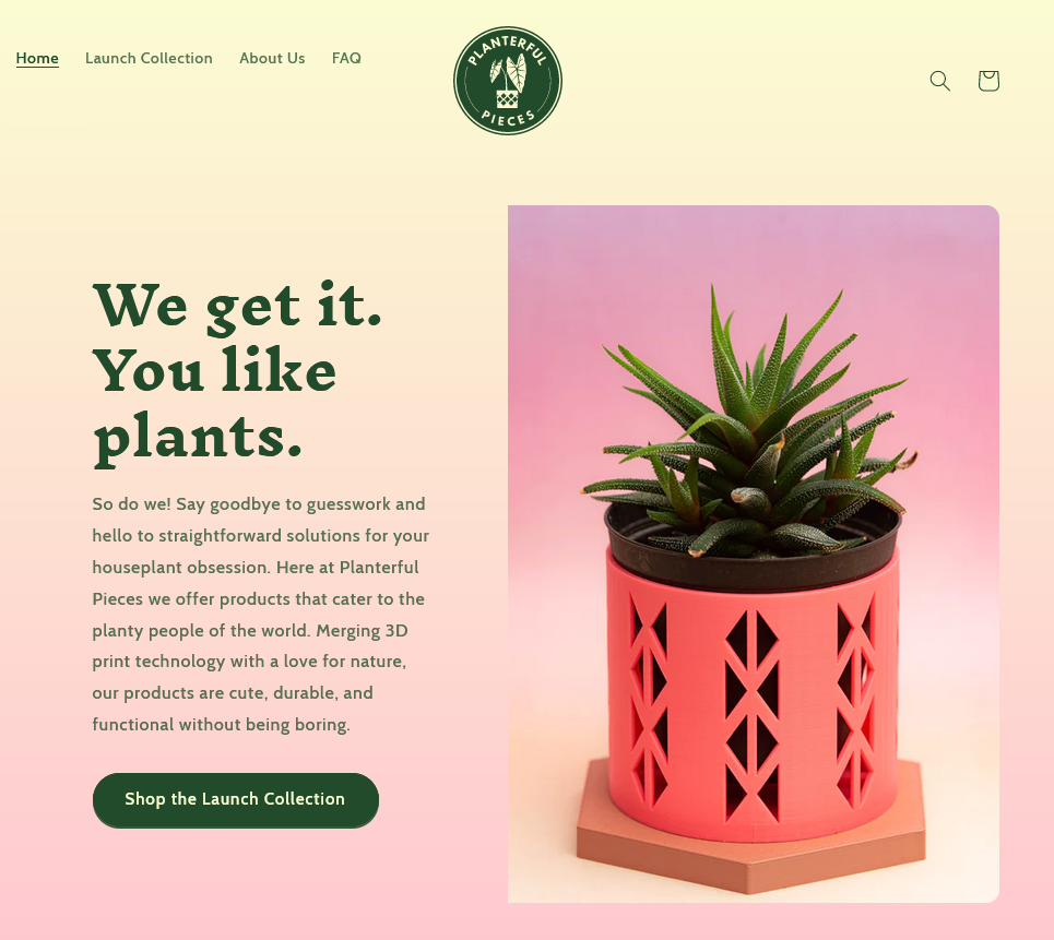
The website