Product Design: Virtualitics Data Dimensions
For three years, I worked at Virtualitics’ as the resident designer/developer. While my work meant doing a lot of front end UI integration in Unity, it also gave me avenues for exploring new kinds of data visualization and methods of interaction in Virtual Reality - often directly translating into additions to the application based on my designs.
New Data Dimensions - Pulsation & Arrow
As the product was expanding, I was challenged by the CTO to develop new data dimensions for visualizing data - we already had color, size, shape, and many other options. Over the course of several weeks, I programmed and designed a sandboxed and less complicated version of the application to test different ways of visualizing data in three dimensions.In these datasets, I explored the use of pulsation (rapidly growing and shrinking in size) to show a spectrum of values, alongside arrows (traditionally called vectors), which is particularly useful for datasets that use things like aerodynamics. Here, you can easily see the visual differences between pulsation speeds and the rotation of the points based on their vectors (the arrows sticking out of the 3D models).
These were liked enough that they were rapidly implemented into the app, where they can be used today as part of the final application. You can read about how to use them on the official documentation website:
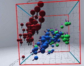
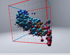
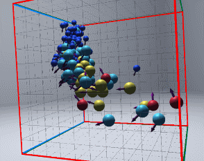
Prototyping the use of arrow and pulsation dimensions on multiple datasets.
Arrow, being used in the final application.
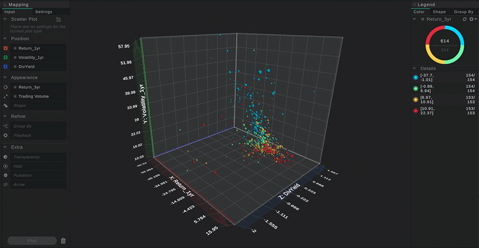
Pulsation, being used in the final application.