UX Design: Clerestory App
Echobind is heavily involved with Clerestory, and part of that is designing and building out the app. As the team has changed designers many times, I was tasked with both implementing the new identity assets and realigning the designs for implementation by the development team. I also worked to clean up the UX and streamline new features.
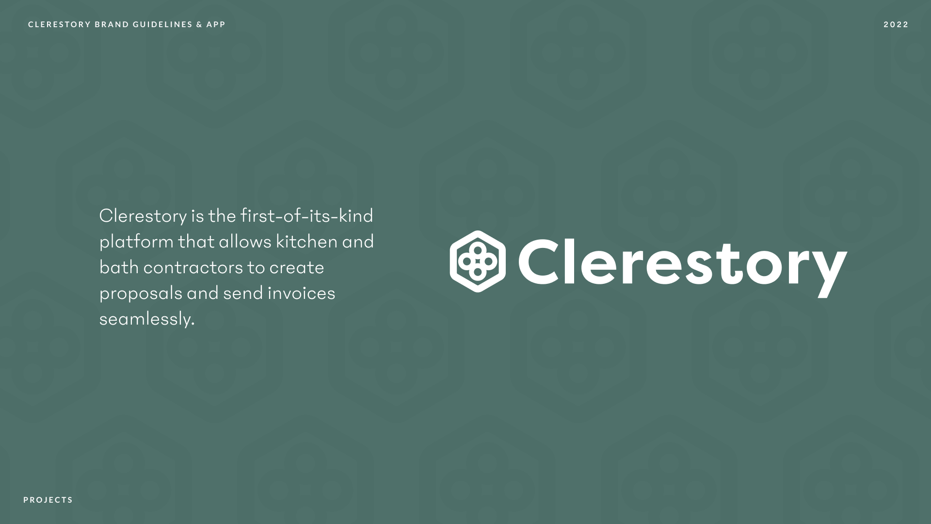
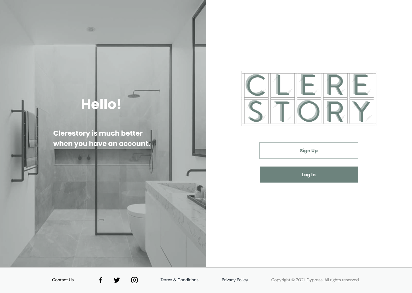
Clerestory rebrand logo and color treatments, by Jacob Galito, senior designer at Echobind.
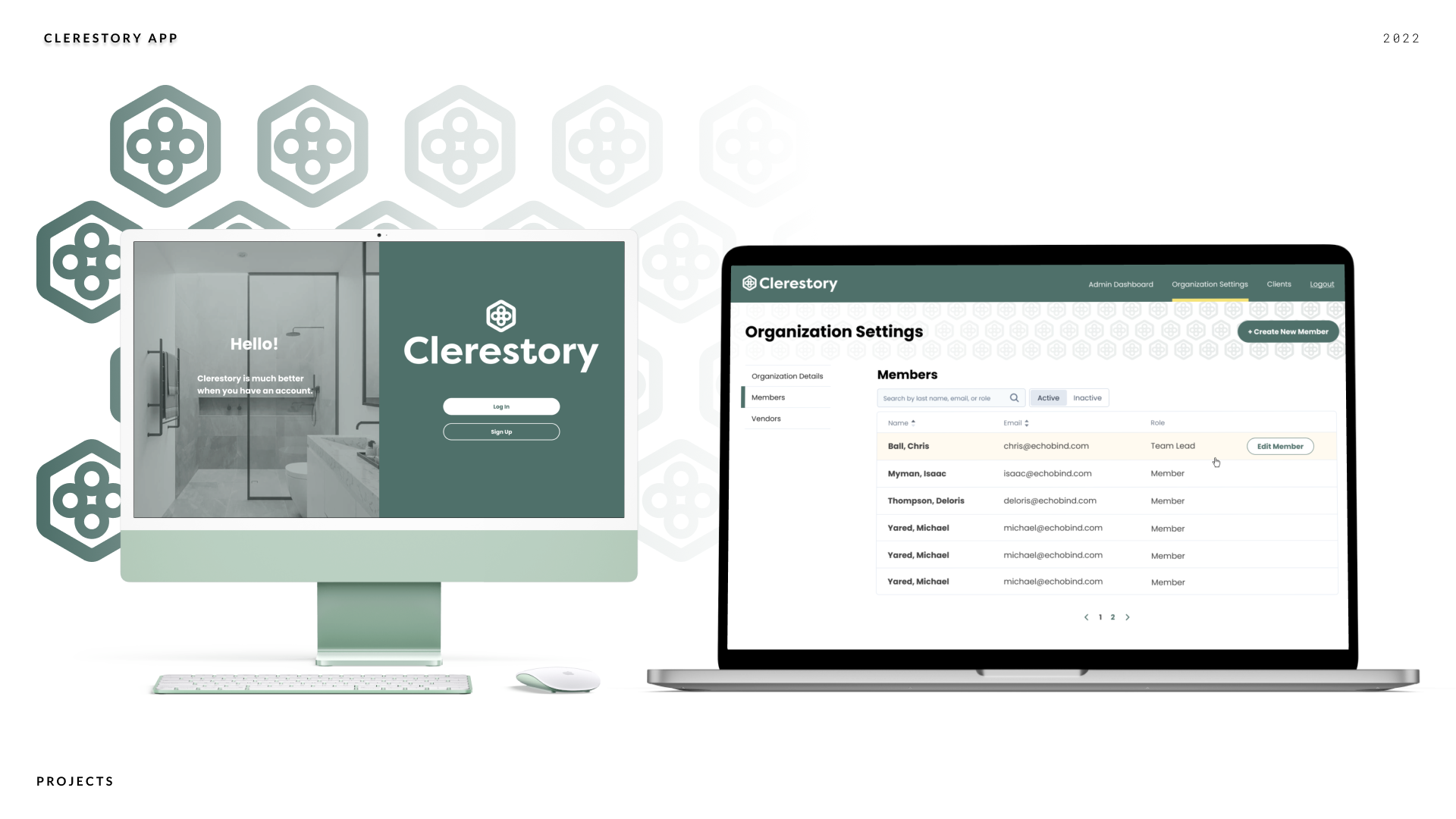
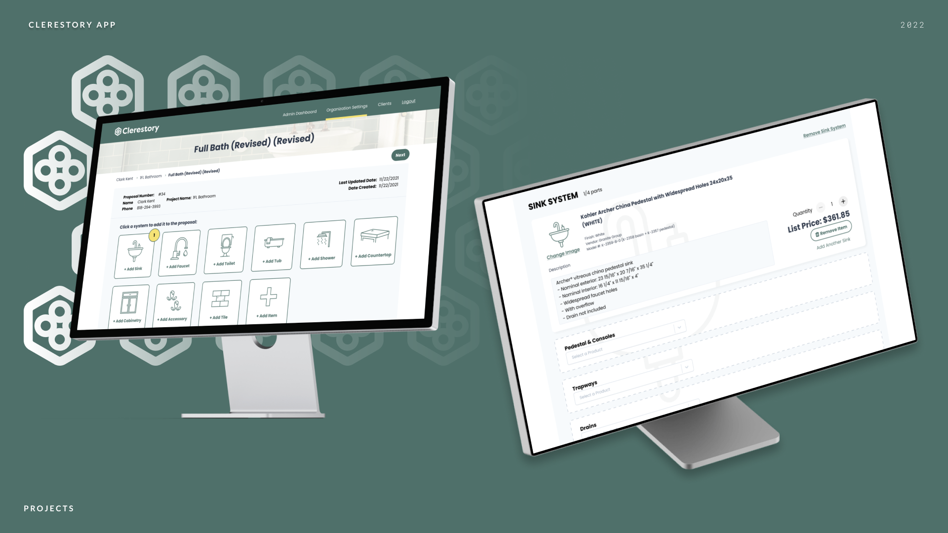
Treatments of the redesigned app and applied identity, by me.
Left: Previous app wires. Right: Newly reorganized and redesigned app wires.
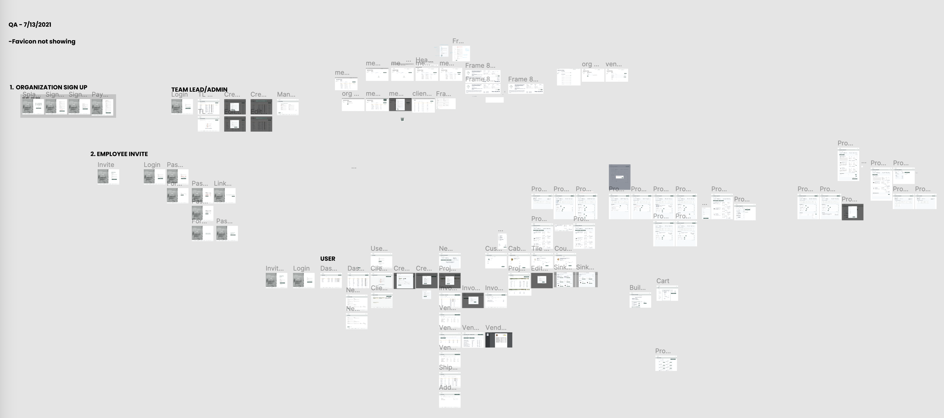
Until I was brought onto the project, the wires were very disorganized, with several iterations of the same ideas and unapproved/implemented changes living within the same design file.
In order to bring the app to a level of “Source of Truth” for developers to actually use, I did a survey of the app as it was currently implemented, brought those changes into the wires, eliminated unused ideas, and organized them according to how the app actually currently exists. Once that was done, I was then able to quickly tackle design tickets and give the app a fresh coat of paint with an applied identity.
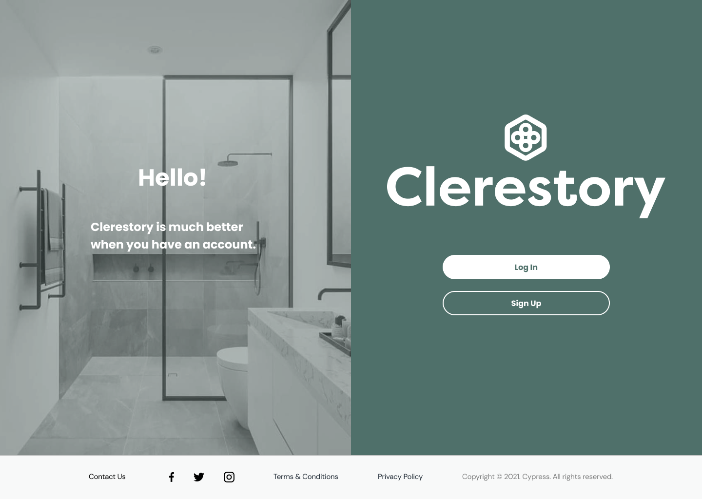
Left: Old identity and implementation. Right: Rebrand and updated visual style.
Applying the identity was a fun exercise - as the identity was completely unused, I was able to find new ways to implement the secondary colors and logo to create patterns and visual interest. I also took a pass at accessibility to make sure we were compliant with WCAG standards.

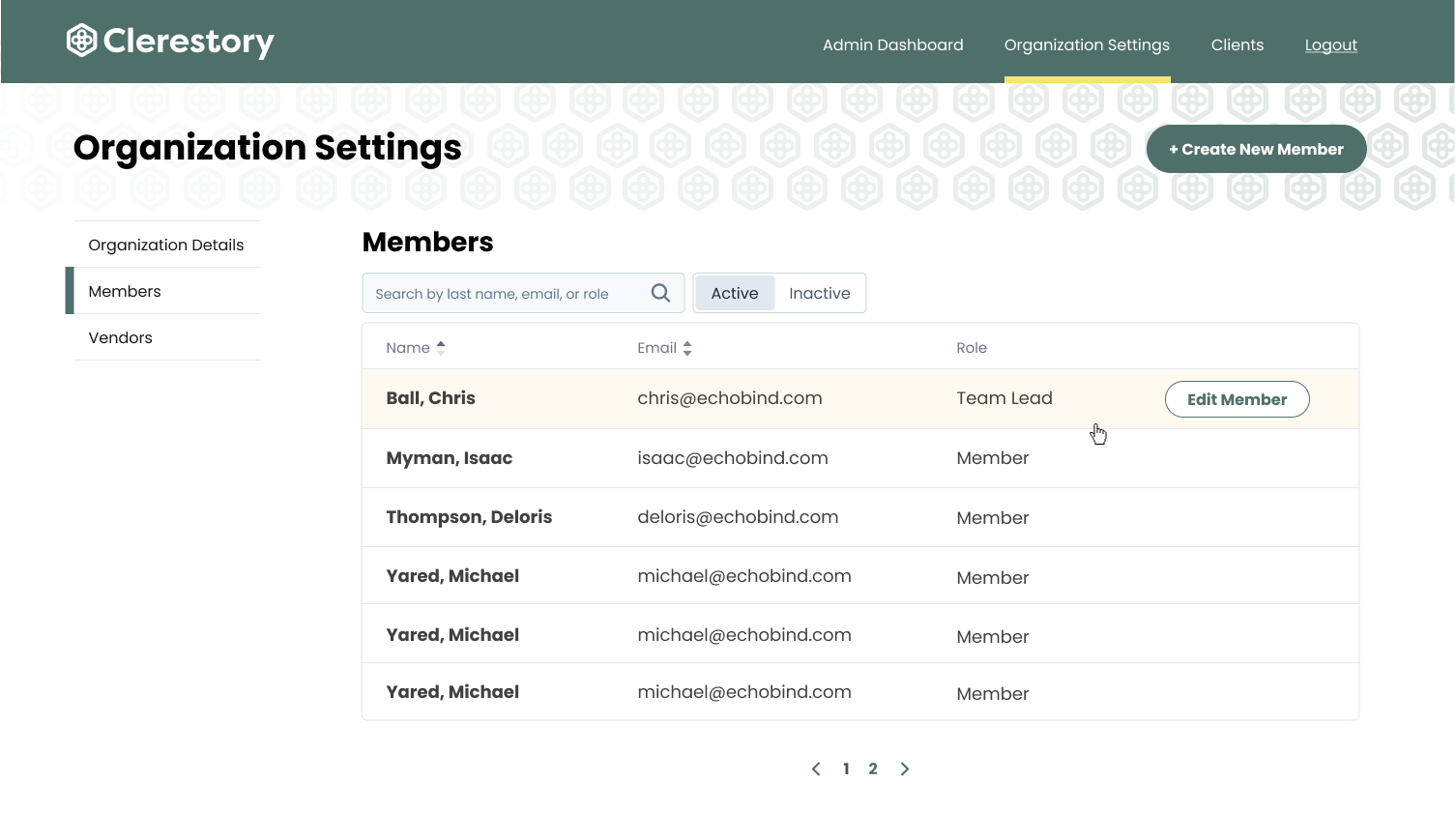
Left: Old wires and mouseover, largely monochromatic and white-on-white. Right: Use of logo as pattern mimicking bathroom tile, yellow to draw visual interest, distinct separation of heirarchy to denote different actions.


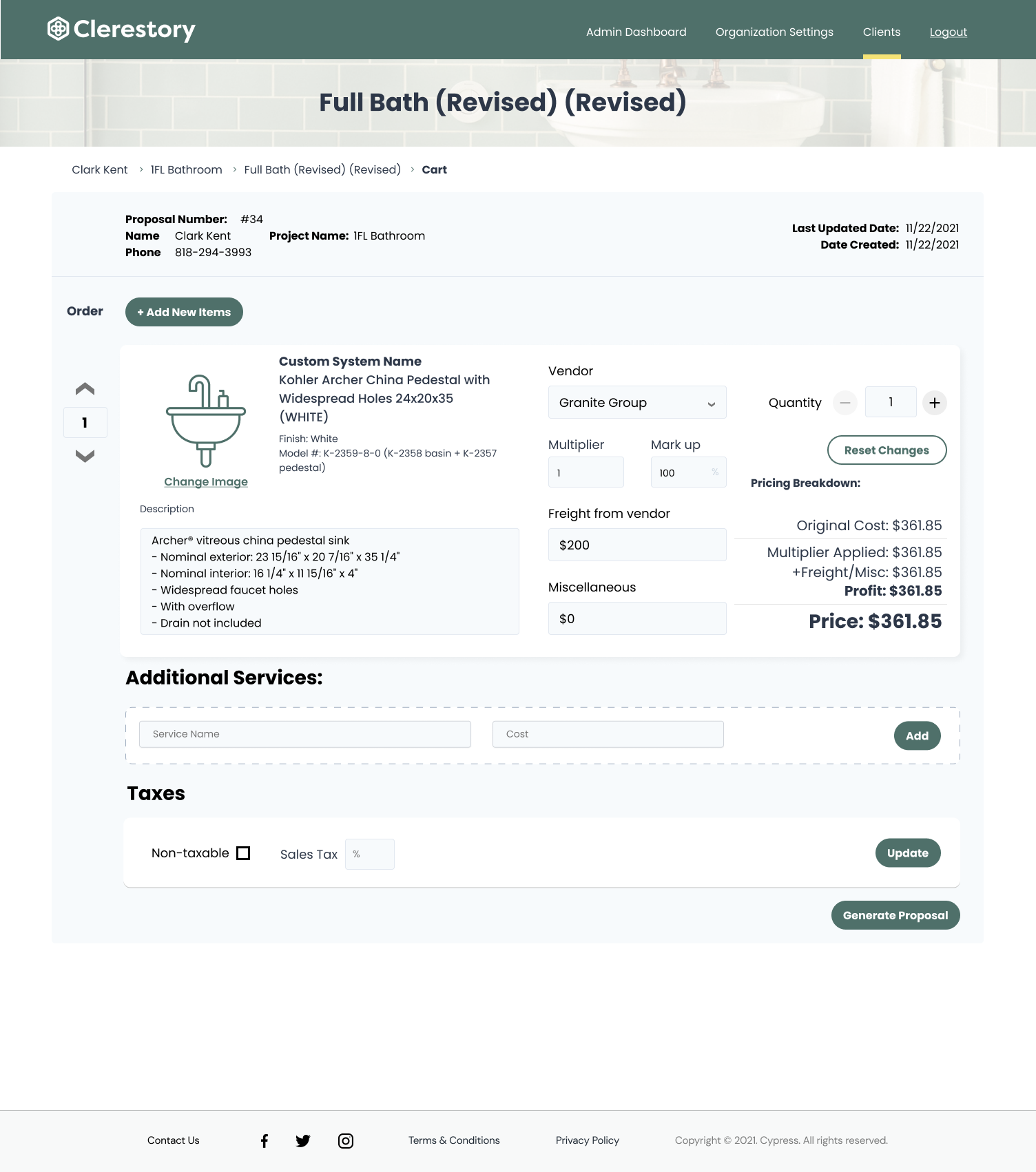
Left: Old modals. Right: New modals, with background using the tile concept.
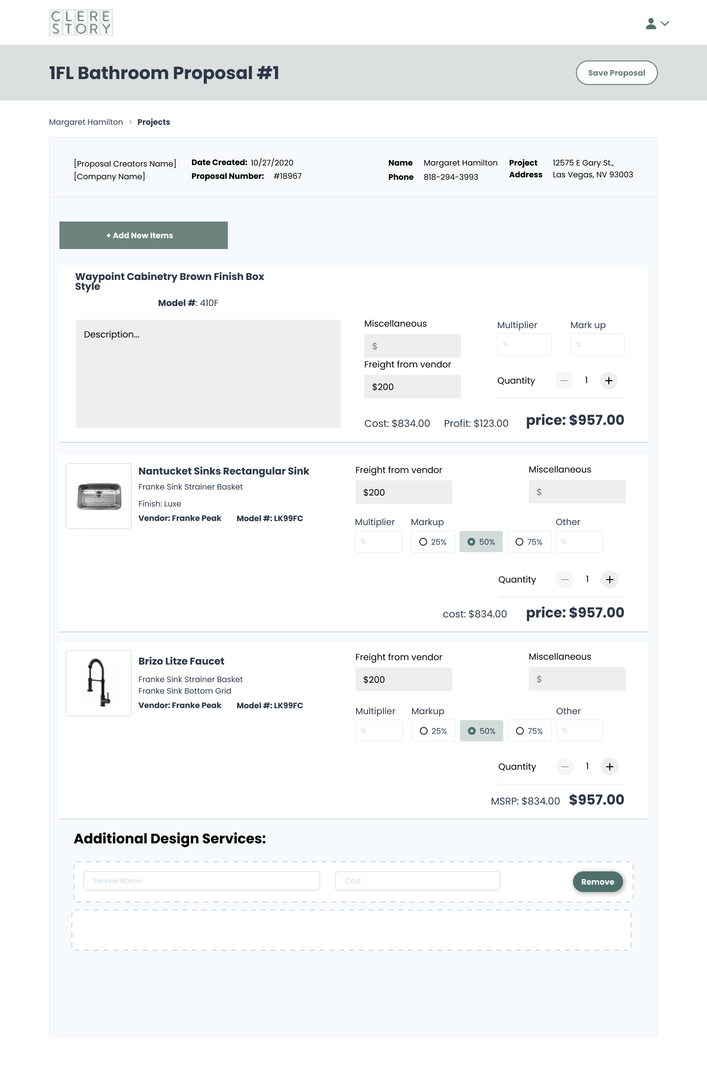
Left: Old checkout screen with differing cost breakdowns. Right: Cost breakdowns in a clear list, editable fields in a single column. Type of project denoted by imagery in header.
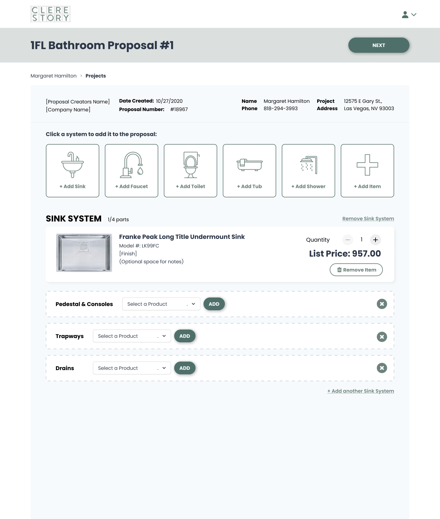
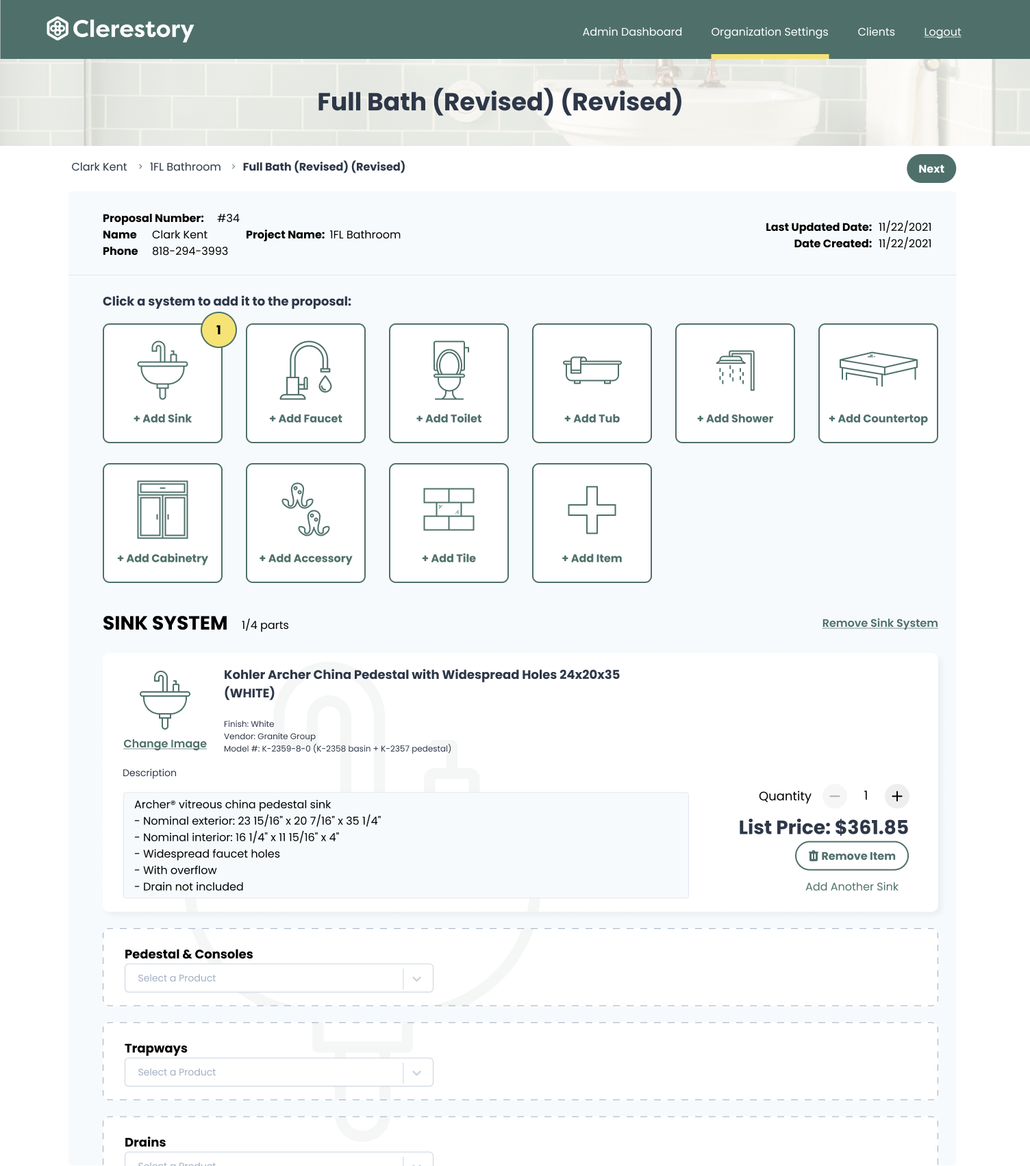
Left: Old set of options for adding systems, lack of clarity to what section of the app the user is in, lack of imagery establishing app identity. Right: Using sink in background of sections of app to denote which part of the system a user is editing, use of yellow to denote amount of eachs system in a proposal, clear header and heirarchy.